Got an idea? A vision?
We want to hear it.
Let’s Chat & Make It Happen…or email us at hello@bluewhaleapps.com and we’ll follow up promptly!


Check-up is a virtual waiting room bringing family and loved ones together in times of need. It is the perfect solution for sharing real-time updates on a patient in a hospital with distant family members.
The client was seeking a patient monitoring app that would make it easy and very less stressful for patients. The idea was to share real-time updates on a patient in a hospital with distant family members.
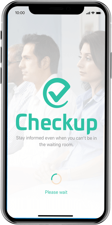
The client, a medical provider, wanted to make it possible for the distant family members to get real-time updates on a hospital patient. So, he wanted us to create an easy-to-use patient monitoring app that can reduce the stress of the patients’ families.
The objective was to allow one person to share updates with everyone they invite to a group. Topics could cover when a patient is finished with surgery or when they are being released.
Product Analysis, Product Strategy, Digital Experience Design, Logo Design, Branding, Mobile App Development
Swift, Twilio integration for Text Messages, Google Maps API, RoR, Heroku, OneSignal for Push Notifications
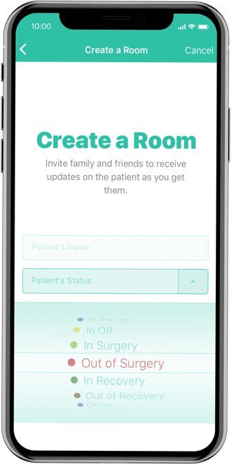


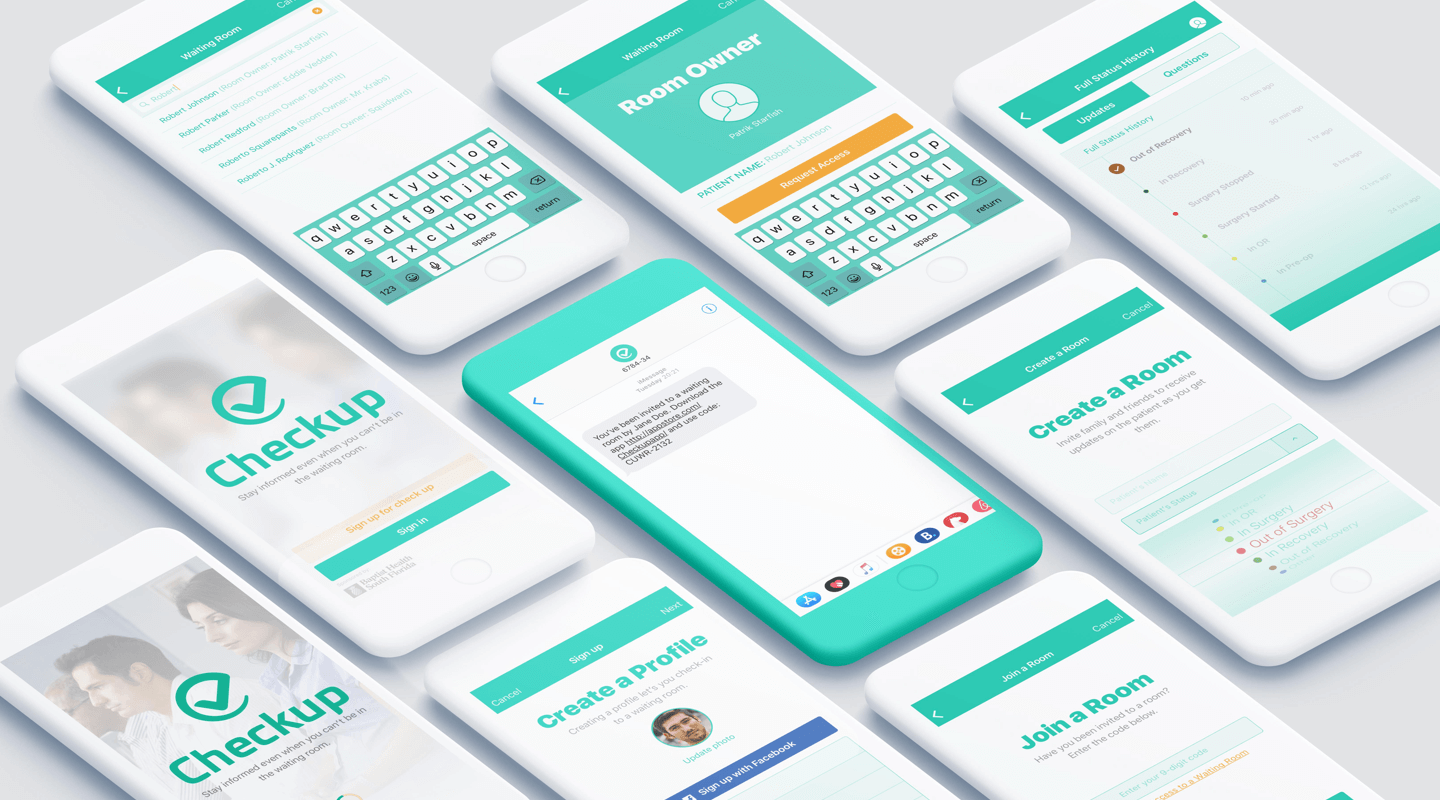
Besides, they wanted us to include the followings in the development process
 Push notifications
 Text message integration
 Google Maps API integration
 Deep Linking
 Web Portal for Online Administration
We started the project with a concrete plan with the help of our experienced designers and developers.
We decided to use tones that can establish an overall sense of tranquility essential to help users focus on the important features of the app. So we picked cold colors for the background of the app.
We decided to use a combination of robust frameworks, languages, and tools to make the solution real-time and scalable.
The finished app exceeded all client expectations. We succeeded in creating an easy-to-use app with real-time notification. Also, it made it possible for all in a waiting room to share comments, ask questions and navigate an interactive map.
Overall, we were happy to provide a full spectrum of end-to-end services including Prototype and flow Design, Software Architecture, native iOS development, back-end database architecture and API development, and App Store deployment.
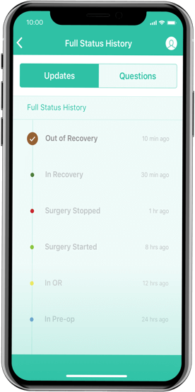
The benefits our client is getting from this app is outstanding:
