Introduction
In today’s digital age, accessibility isn’t just a buzzword; it’s a necessity. Ensuring your website is accessible to all users, including those with disabilities, is not only a legal requirement but also a moral obligation. It enhances user experience, broadens your audience, and reflects positively on your brand. This blog will guide you through the top 10 focus areas to boost your CMS (Content Management System) accessibility scores, empowering you to create a more inclusive digital space.
The Importance of Accessibility in the Digital Age
The internet is a vast resource of information, services, and opportunities. For many, it’s an indispensable part of daily life. However, millions of people with disabilities face barriers that hinder their online experience. By prioritizing accessibility, we ensure everyone has equal access to digital content, fostering inclusivity and social responsibility.
Legal and Moral Obligations for Website Accessibility
Various laws and regulations, such as the Americans with Disabilities Act (ADA) and the Web Content Accessibility Guidelines (WCAG), mandate website accessibility. Non-compliance can lead to legal repercussions and damage your reputation. Beyond legalities, ensuring accessibility is a moral imperative, demonstrating your commitment to inclusivity and respect for all users.
Overview of the Blog’s Focus
This blog highlights the top 10 areas to improve your CMS’s accessibility scores. From semantic HTML to responsive design, we’ll explore practical tips and examples to help you create a more accessible and user-friendly website.
1. Semantic HTML
Definition and Importance
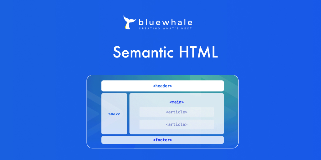
Semantic HTML involves using HTML tags to convey the meaning of the content. Tags like `<header>`, `<nav>`, `<article>`, and `<footer>` provide context to both browsers and assistive technologies, making it easier for users to understand and navigate your site.
Examples of Semantic Tags and Their Uses
- `<header>` for introductory content
- `<nav>` for navigation links
- `<main>` for the main content area
- `<article>` for self-contained content
- `<footer>` for footer information
Benefits for Screen Readers and Assistive Technologies
Semantic HTML improves the readability of your site for screen readers and other assistive technologies. It helps these tools interpret and present content accurately, enhancing the user experience for individuals with disabilities.
2. Alt Text for Images
Importance of Descriptive Alt Text
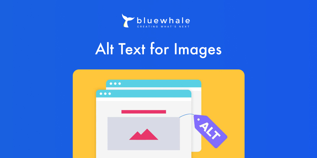
Alt text (alternative text) describes the content of images, allowing screen readers to convey this information to users who are visually impaired. It’s crucial for understanding the context and purpose of the images on your site.
Guidelines for Writing Effective Alt Text
- Be concise yet descriptive.
- Avoid phrases like “image of” or “picture of.”
- Include relevant details that enhance understanding.
Examples of Good vs. Bad Alt Text
- Good: “A group of friends enjoying a picnic in the park.”
- Bad: “Picnic.”
3. Keyboard Navigation
Necessity of Keyboard Navigability
Many users rely on keyboards instead of a mouse to navigate websites. Ensuring all interactive elements are keyboard accessible is vital for providing an inclusive user experience.
Ensuring All Interactive Elements Are Keyboard Accessible
- Use `tabindex` to manage focus order.
- Ensure buttons, links, and forms are navigable via keyboard.
- Implement skip navigation links for easy access to main content.
Providing Visible Focus States
Visible focus states help users understand which element is currently selected. Use CSS to style focus states with clear visual indicators, such as borders or background changes.
4. Accessible Forms
Design Considerations for Accessible Forms
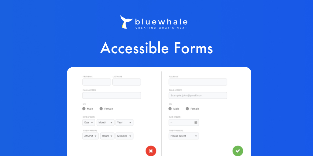
Forms are essential for user interaction, so making them accessible is crucial. Use clear labels, logical tab order, and descriptive error messages to enhance usability.
Clear Labeling and Instructions
- Use `<label>` tags to associate labels with form fields.
- Provide instructions and hints for input fields.
Ensuring Forms Are Navigable and Submittable
Ensure forms are fully functional via assistive technologies. Use proper ARIA (Accessible Rich Internet Applications) roles and properties to convey additional information to screen readers.
5. Color Contrast
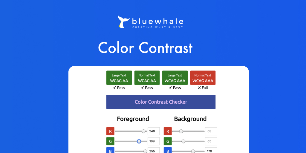
Importance of Sufficient Color Contrast
Adequate color contrast ensures text is readable for users with visual impairments, including color blindness. High contrast ratios improve legibility and overall user experience.
Tools and Methods to Check Color Contrast
- Use tools like WebAIM’s Color Contrast Checker.
- Aim for a contrast ratio of at least 4.5:1 for text and 3:1 for larger text.
Examples of Compliant and Non-Compliant Color Combinations
- Compliant: Dark blue text on a white background.
- Non-Compliant: Light gray text on a white background.
6. ARIA Landmarks
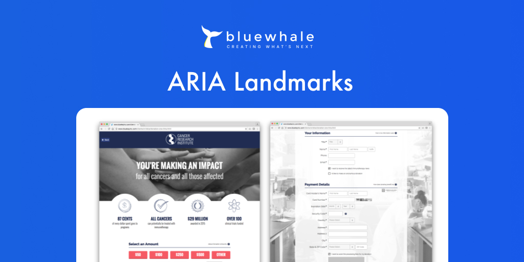
Introduction to ARIA Landmarks
ARIA landmarks define regions of a page, making it easier for screen reader users to understand and navigate the content. Common landmarks include banner, navigation, main, and contentinfo.
Common ARIA Landmarks and Their Implementation
- `<div role=”banner”>` for the header section.
- `<nav role=”navigation”>` for navigation menus.
- `<main role=”main”>` for the main content area.
Benefits for Screen Reader Users
ARIA landmarks provide a structural framework, improving navigation and enhancing the user experience for individuals using screen readers.
7. Responsive Design
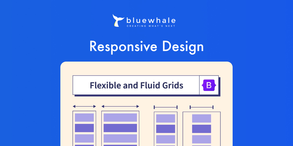
Significance of Responsive Design
Responsive design ensures your website is accessible and functional across all devices and screen sizes. It adapts the layout to provide an optimal viewing experience, regardless of the device.
Ensuring Content Is Accessible on All Devices
- Use flexible grids and layouts.
- Implement media queries to adjust styles based on screen size.
- Optimize images for different devices.
Benefits for Users with Various Assistive Technologies
Responsive design enhances accessibility for users with various assistive technologies, such as screen magnifiers and voice recognition software.
8. Multimedia Accessibility
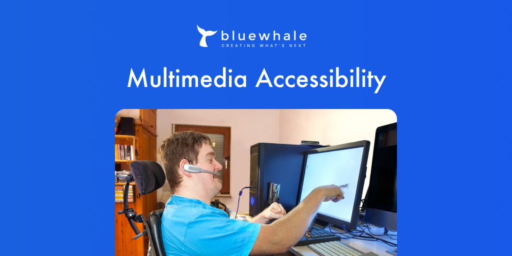
Providing Captions and Transcripts
Captions and transcripts make audio and video content accessible to users who are deaf or hard of hearing. They provide a textual representation of spoken words and sounds.
Ensuring Video Players Are Accessible
Use video players that support keyboard navigation and screen readers. Provide controls for adjusting playback speed, volume, and captions.
Benefits for Users Who Are Deaf or Hard of Hearing
Providing captions and transcripts ensures everyone can access and enjoy your multimedia content, regardless of their hearing ability.
9. Descriptive Link Text
Importance of Descriptive Link Text
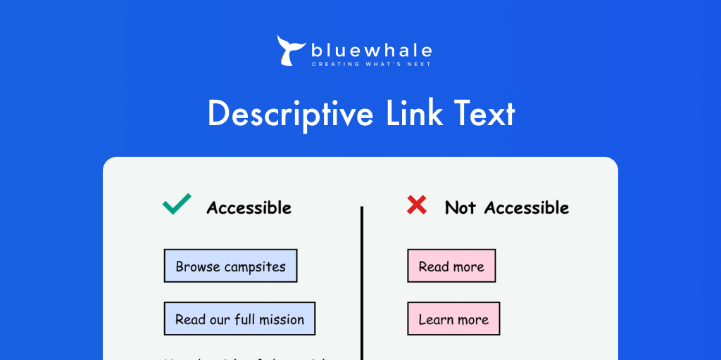
Descriptive link text helps users understand the purpose of a link without needing additional context. It improves navigation and accessibility for screen reader users.
Guidelines for Writing Effective Link Text
- Be specific and descriptive.
- Avoid generic phrases like “click here” or “read more.”
- Provide context for what the link leads to.
Examples of Good vs. Bad Link Text
- Good: “Download the accessibility guidelines PDF.”
- Bad: “Click here.”
10. Consistent Navigation
Necessity of Consistent Navigation
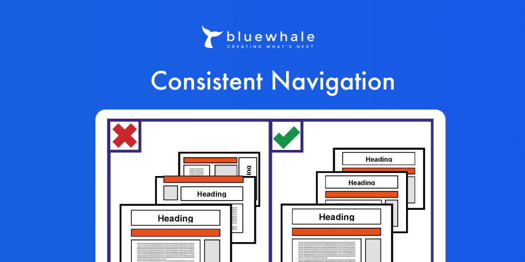
Consistent navigation ensures users can easily find and access content on your site. It benefits all users, particularly those with cognitive impairments and using assistive technologies.
Benefits for Users with Cognitive Impairments
Clear and predictable navigation reduces cognitive load and enhances the user experience for individuals with cognitive impairments.
Ensuring Menus and Navigation Bars Are Logically Organized
- Use consistent layouts and menu structures across all pages.
- Group related items together.
- Provide clear headings and labels for navigation elements.
Conclusion
Improving your CMS’s accessibility scores is a vital step towards creating a more inclusive and user-friendly website. By focusing on these top 10 areas, you can enhance the online experience for all users, regardless of their abilities. Remember, accessibility is an ongoing process. Continuously evaluate and improve your site to ensure it meets the needs of all users.
If you’re looking to boost your CMS accessibility scores further, consider reaching out to Blue Whale Apps for expert assistance. Our team is dedicated to helping you build a more inclusive web. Let’s work together to create a digital space that everyone can access and enjoy.


